Meta title:
Meta description: Learn how to build high-converting landing pages with practical design, copy, and testing strategies. Includes a checklist, headline formulas, and optimization tips to boost conversions.
Introduction
Landing pages are the gateway between a marketing touchpoint and a conversion. Whether your goal is lead generation, product signups, or sales, a well-crafted landing page turns visitor interest into measurable action. This article walks through proven principles, practical tactics, and common pitfalls so you can design landing pages that convert consistently.
Why landing pages matter
- Focused intent: Unlike homepages, landing pages are single-purpose. They remove distractions and guide visitors toward one clear action.
- Better ad performance: Tailored landing pages improve relevance for paid search and social ads, lowering cost-per-click and increasing conversion rates.
- Measurable outcomes: Landing pages make it easy to track conversion funnels and optimize based on data.
Core elements of high-converting landing pages
A strong landing page typically contains these components:
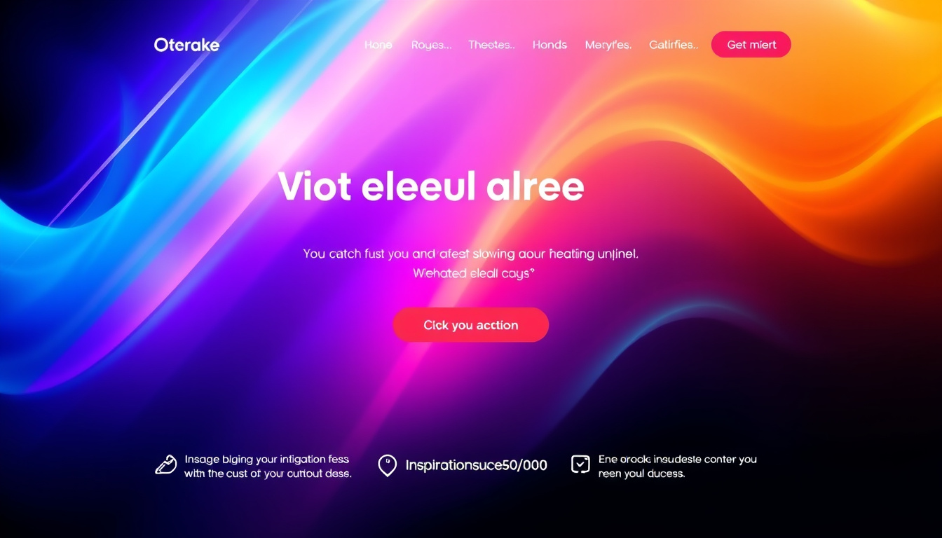
- Compelling headline: Communicates the main benefit within seconds.
- Supporting subheadline: Adds context and reinforces the headline.
- Visuals: Product images, hero shots, or explainer videos that demonstrate value.
- Benefit-driven copy: Short, scannable paragraphs or bullets that answer “What’s in it for me?”
- Single, prominent CTA (call to action): Clear, action-oriented, and visible without scrolling.
- Social proof: Testimonials, logos, reviews, or case studies that build trust.
- Form or purchase mechanism: Simple and as short as possible—only ask for what you need.
- Trust signals: Security badges, guarantees, privacy reassurance.
- Mobile optimization: Responsive layout, fast load times, and thumb-friendly CTAs.
Headline and copywriting tips
- Prioritize clarity over cleverness. Visitors should understand the offer in 3 seconds.
- Use benefit-led headlines: “Get X Outcome in Y Time” works well.
- Address objections proactively: Include one or two lines that remove common barriers or doubts.
- Use scannable formatting: short paragraphs, bullet lists, bolded benefits.
- Keep voice consistent with your brand but focused on the visitor’s needs.
Design and UX best practices
- Visual hierarchy: Place the headline and CTA “above the fold” with contrasting colors for the CTA.
- Minimal navigation: Remove global menus that can distract from the conversion goal.
- Use whitespace: It increases readability and draws attention to key elements.
- Images that convert: Show the product in use or a human face to increase trust and empathy.
- Accessibility: Ensure proper color contrast, readable fonts, and alt text for images.
Forms, CTAs, and friction reduction
- Reduce form fields: Shorter forms dramatically increase completion rates. Consider progressive profiling for longer data needs.
- CTA language: Use action verbs + benefit (e.g., “Get My Free Audit,” “Start Your 14-Day Trial”).
- Button design: Make the button large, high-contrast, and clearly labeled.
- Micro-commitments: Offer low-friction options (e.g., “Download PDF” before asking for more info).
Testing and measurement
- Track the right metrics: conversion rate, bounce rate, time on page, cost per acquisition (CPA), and form abandonment rate.
- A/B test one element at a time: headline, button color/text, hero image, or form length.
- Use heatmaps and session recordings to identify where visitors drop off or get confused.
- Segment tests by traffic source—what converts for organic visitors may differ for paid traffic.
Speed and mobile optimization
- Page speed matters: Each second of delay reduces conversion. Compress images, minify scripts, and use a CDN.
- Mobile-first design: Ensure CTAs are reachable and forms are easy to complete on small screens.
- Test on real devices and network conditions to replicate actual user experiences.
Common landing page mistakes to avoid
- Trying to serve too many audiences on one page.
- Weak or vague CTAs.
- Cluttered layouts with distracting navigation.
- Neglecting mobile users.
- Not testing or iterating based on data.
Practical headline formulas and CTA examples
Headline formulas:
- “Get [Desired Outcome] in [Timeframe]” — “Get Marketing-Qualified Leads in 30 Days”
- “How to [Desired Outcome] Without [Pain Point]” — “How to Scale Sales Without Extra Headcount”
- “[Number] Ways to [Achieve Benefit]” — “5 Ways to Double Email Open Rates”
CTA examples:
- “Start Your Free Trial”
- “Get My Free Audit”
- “Download the Template”
- “Book a 15-Minute Demo”
Landing page optimization checklist
- Clear, benefit-focused headline
- Relevant hero image or video
- Strong, visible CTA above the fold
- Short, scannable supporting copy
- Reduced form fields / clear form labels
- Social proof and trust signals
- Fast load time and mobile responsiveness
- Analytics tracking and A/B test plan
Conclusion
Landing pages are a high-leverage asset: small improvements often yield big gains in conversion and ROI. Focus on clarity, relevance, and reducing friction. Test iteratively, measure outcomes, and keep the visitor’s primary motivation at the center of every decision. Follow the checklist and principles above to unlock higher conversion rates and make your landing pages a reliable engine for growth.
Want a tailored review? Share a link to your landing page and I’ll provide specific optimization suggestions.
Try this workflow today, Writer Link AI and Write Easy provide smart outputs with a natural voice. Get started with a free plan at